Are you selling products online? Do you have a landing page?
Well this indepth guide shows you how to create a landing page that C.O.N.V.E.R.T.S.
It’s an A.W.E.S.O.M.E article that’s defo worth keeping…
So you’ve got your marketing all set. You have paid search ads going, your pages are well optimized and generating good natural search, your Facebook ads are working, and you’re getting lots of traffic. (I know, this probably is a fantasy situation, but let’s go with it.)
People are visiting your site, but for some reason, you’re not seeing your other numbers move at all. Should you throw up your hands and conclude that your marketing doesn’t work?
Not yet. The first thing you might want to look at is what people do after they go through your ads. If you don’t have a good landing page, it’s like going fishing without a net: you might land a big one on your hook, but you won’t be able to drag it into the boat.
You don’t want people to just visit your page. You want them to take action once they are there. So make it as easy and compelling as possible for them by including these elements found in a landing page that CONVERTS:
C = Clear Call to Action
O = Offer
N = Narrow Focus
V = VIA: Very Important Attributes
E = Effective Headline
R = Resolution-Savvy Layout
T = Tidy Visuals
S = Social Proof
CLEAR CALL TO ACTION
In a famous scene from Glengarry Glen Ross, the man sent to train the hapless salesmen sums up his sales mantra – ABC: Always Be Closing. This should be the mantra of your landing page, too. And the way you accomplish ABC is by focusing on your call to action.
The call to action (CTA) is what you want visitors to do: Shop Now. Sign Up. Try It. Contact Us. See Our Video.
Whatever it is you’ve decided will move people further along your conversion funnel. That’s what you should be asking them, clearly and temptingly, to do. Don’t distract them with lots of other requests. The best pages accentuate only one CTA.
Considerations for strategy
This is a very powerful (and easy) area to test. So test color, size, and placement of the button. Test relatively demure copy (“Support Our Cause”) against more demanding copy (“Donate Now”).
Considerations for design
- Make sure the CTA is displayed at least once in a visually distinct, centralized, and obviously buttony-looking button. Don’t make people guess at what they should click on.
- Use visual cues, such as arrows or images of people looking at the button, to draw the eye.
- If you have other CTAs on the page, de-emphasize them visually compared with the primary CTA.
- If you have content below the fold, repeat the CTA. Always make it easy and compelling for the visitor to take the desired action.
The cautionary tale
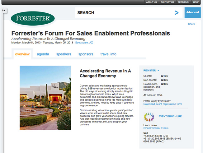
Forrester Research. It’s really not clear what you’re supposed to do here. Do an advanced search? That’s the only thing that’s visually set apart, and it has a nice arrow pointing to it. Not sure how that helps them sell events.
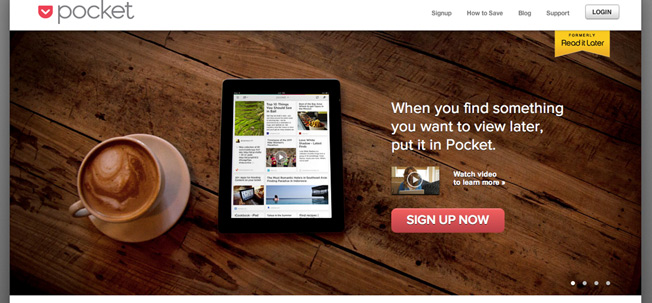
Doing it right
Pocket. The eye goes right to the CTA. Especially nice is the way the video is miniaturized here, because often the play button on a video can be distracting.
OFFER
An offer is anything you give your visitors in exchange for getting them to do what you want. This can mean offers in the traditional sense of coupons or discounts, but it also can mean a free trial, a free version of the product, a whitepaper, or a matching gift.
Considerations for strategy
The best offers pull users deeper into the conversion funnel:
- A bill pay website might offer users $10 for the first bill they pay, which would require them to sign up for the service and connect their accounts.
- A consulting agency might offer a free 60-minute consultation, which really is a meeting to describe how awesome the agency is.
Whatever you offer, try pairing it with a deadline to create a sense of urgency and spur a response.
Considerations for design
Make sure the offer is conveyed simply and that it doesn’t distract from the CTA.
The cautionary tale
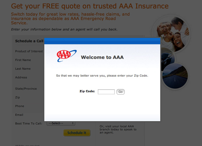
AAA. There’s a lot going on (wrong) here. Most insurance sites offer a free quote with minimal information (mostly just a ZIP code). AAA takes more of a “demanding” rather than “offering” approach, blocking your view of their page until they get what they want. Peeking into the gloom, you can see that even after they get your ZIP, you get zip – just an invitation for someone to call you. Just what everyone wants!
Doing it right
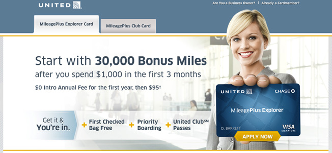
United. Credit cards almost always include an offer – no surprise given the direct mail experience these companies have. Note that the offer requires the cardholder to use the card over several months, by which time, hopefully, its use will have become ingrained. Good visual cues drawing the eye to the CTA, too.
NARROW FOCUS
AKA Keep It Simple, Stupid. Research has shown that the more choices you offer people, the longer they take to make a decision. So the clearer and simpler you make your page, the more likely you are to get someone to take the action you want.
- Do you really need that navigation bar? Take it off or visually minimize it, and otherwise eliminate things that can be clicked on that aren’t your CTA.
- Do you really need to talk about your company philosophy? Move it to the “About” section and limit content that doesn’t serve the purpose of moving people down the funnel.
- Do you really need to collect all that information? If you’ve got a form on your page, keep it short. Study after study has shown that more fields = lower response, so ask your visitors for the bare minimum.
All this advice is particularly hard for marketers to follow when it comes to the most important landing page on their site: their home page. No matter what kind of marketing you’re doing, a huge chunk of your traffic is going to hit your home page first, so it should be treated like any other landing page. (It should be stripped of extraneous links, actions, and content.)
Focus on the CTA and leave links about your job listings and office Chihuahua for well below the fold (meaning out of the region that people see when they first get to the page).
Considerations for strategy
- Keep copy brief and make sure everything you place on the page is relevant to its purpose.
- Although many people will flow through your home page, you don’t have to send all of them there. Creating dedicated landing pages for your marketing programs will help you stay focused.
- Form length is another great area for testing!
Considerations for design
- Use visuals to keep the focus on the most important features of the page.
- Set off the core space of the page with white space and move administrative links to a visually down-played footer.
- Make sure any header or side links don’t distract from the core mission of the page.
The cautionary tale
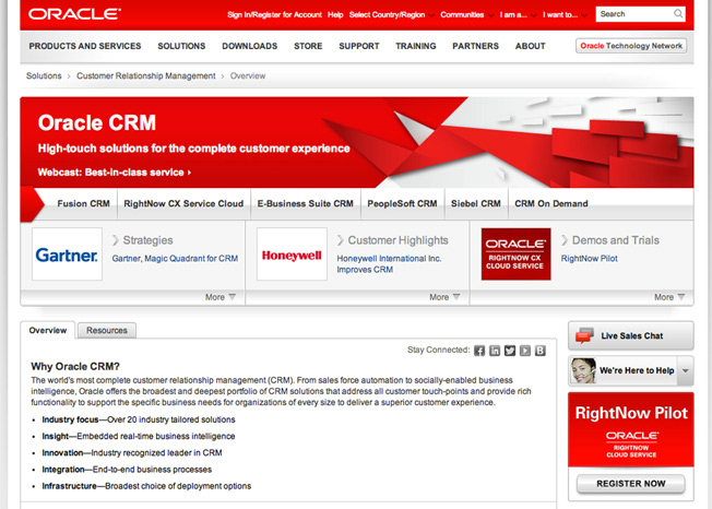
Oracle. How many things are there for you to click on just in this portion of the landing page? Thirty nine. That’s 39 opportunities for whoever visits the page to wander off before completing what the page owner would like the visitor to do. And this is where you ended up after clicking on a paid search ad, so they are paying a lot to distract people. (Sorry, Oracle, I owe you $10.) It’s a perfect example of where using a dedicated page would help them cut out unimportant content and focus on what they want to achieve.
Doing it right
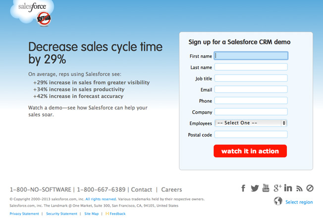
Salesforce. This is by no means the prettiest landing page. But for enterprise software, it is admirably restrained. There’s no navigation bar up top, the few administrative links are tucked away at the bottom, and social links are small and discreetly grayed out. The form asks for just a few fields and follows up with a nice, bright, benefit-offering CTA.
VIA: VERY IMPORTANT ATTRIBUTES
We’ve all heard stories of companies that reserved a catchy URL, put up zero information about what the site was for, and harvested 1 million email addresses before they even launched.
You should assume that’s not going to happen to your company.
Instead, you’re going to have to give visitors some good reasons they should do what you want. Those reasons are the VIA: Very Important Attributes.
The reason for the “V” and the “I” is that this shouldn’t be a laundry list. The visitor is giving your site a quick once over, and they don’t want to read your product manual on the first page. Identify the two to five things about your product or service that you think will be most important to your visitors, and showcase those.
Considerations for strategy
It’s generally believed that you should describe what you’re selling from the customer’s viewpoint. In other words, explain what problems your product or service can help solve. That may be true for your site, or it may not; this is a rich area for testing. In general, you can describe your VIA as:
- Features – a list of cool things about your product or service
- Benefits – how the features will help your visitor
- Pain points – how the features will help your visitor avoid misery
Try different approaches to see what works with your audience. It’s important to test which attributes you highlight, how many you show, and how you describe them.
Considerations for design
- Make sure the list of attributes doesn’t distract from the CTA. You might tease attributes above the fold, and then locate fuller descriptions below the fold.
- Setting attributes off with icons or pictures can make a list more visually appealing and friendly.
The cautionary tale
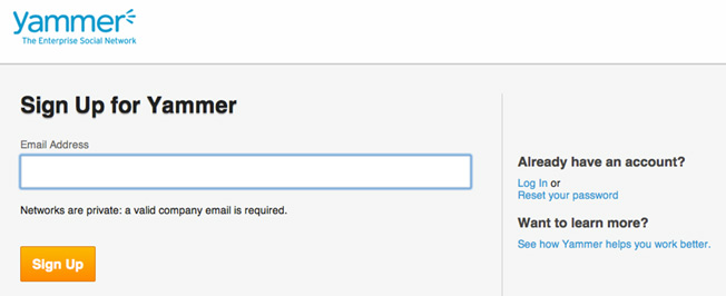
Yammer. So… Now that Microsoft has bought Yammer, are they not actively trying to get people to sign up for it anymore? Because jeez, Yammer, show a little leg. Not only is this the WHOLE sign-up page, but the page you get to for “yammer.com” is just a log-in page. You have to click to find this tempting treat.
Doing it right
Unbounce (below the fold). There is a quick description of three VIA (with links so someone can learn more if they want). At the bottom of the page, there is another visually-distinct CTA for those who are ready to try it out.
EFFECTIVE HEADLINE
Copy written for print or display ads often features a clever, funny, or outrageous headline. It has to because those ads are trying to wave their arms in your face and distract you from whatever it was you were doing so you will look at them instead.
On your webpage, though, you aren’t fighting for attention. You’ve already done something to funnel your visitors there. Now you just need to convince them to pull up their chairs and stay awhile.
People coming to your site are going to decide in a split second if they want to go back to their game of “Words with Friends” or stay and see what you are all about. A key way to keep them is to tell them in plain language what your site is all about.
Selling a blanket with sleeves? “Home of the Slanket, the famous blanket with sleeves.”
Selling a marketing consultancy? “How to market better.”
Selling the latest location app? “Find your friends instantly.”
Considerations for strategy
People who are busy thinking “What the heck do these people do?” are less inclined to read your whitepaper, fork over their address, buy your widget, sign up for your webinar, or download your app. So when you’re writing your headline, go for clear and explanatory over coy and clever.
Considerations for design
Make sure the headline stands out visually, even more so than the logo/name of the site.
The cautionary tale
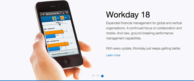
Workday. Between the two-word headline and the secondary text stuffed full of jargon (a trap most enterprise software has a hard time resisting), you come away not really knowing what Workday does. Of course, this is the third entry on a jQuery slider (and one of the other ones was a little better), but do you really want to assume your visitors are going to stick around for your slide show?
Doing it right
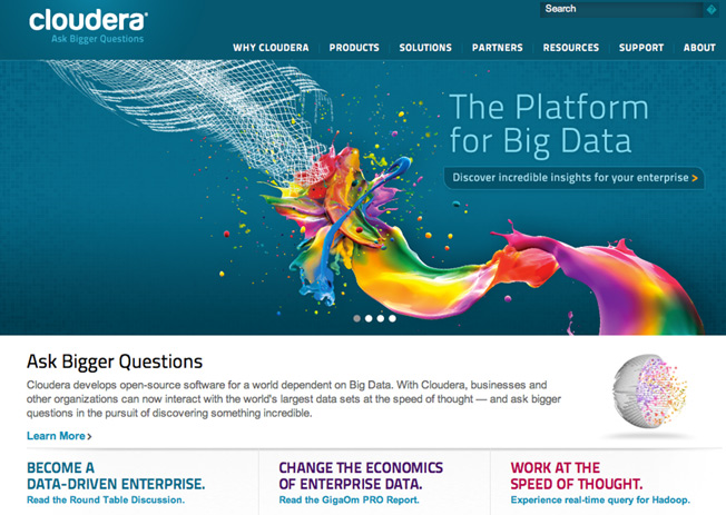
Cloudera. Okay, got it in a split second: it’s a platform for big data. The CTA (which could be better accentuated) tells us it’s for the enterprise.
RESOLUTION-SAVVY LAYOUT
Do you know that there are people out there still surfing the web on 800 x 600 monitors? And that the most popular screen size in the US still is 1024 x 768?
That means the overall visual picture you see on your big HD monitor might be very different from what your customer is seeing. Keep the most essential parts of your message – logo, headline, call to action, a supporting visual – in the center top of the screen, with supporting messaging lower down on the page.
Considerations for strategy
Make sure your designer knows which are the most important elements on your page and puts them front and center.
Considerations for design
If you can adjust your display, check the layout of your page at different resolutions to make sure that even people with older monitors will be able to see your headline and CTA without scrolling. And of course, check it on mobile and tablets.
The cautionary tale
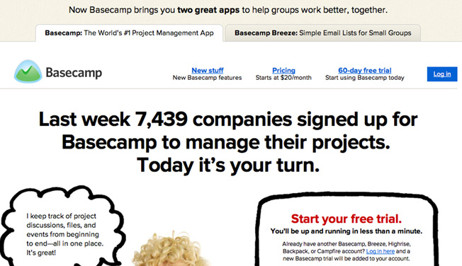
This is Basecamp on a 1024 screen. We’ve got links that look like Google ads, an admittedly solid headline, and a mop of talking blond hair; but, after that, you have to start working for it.
Doing it right
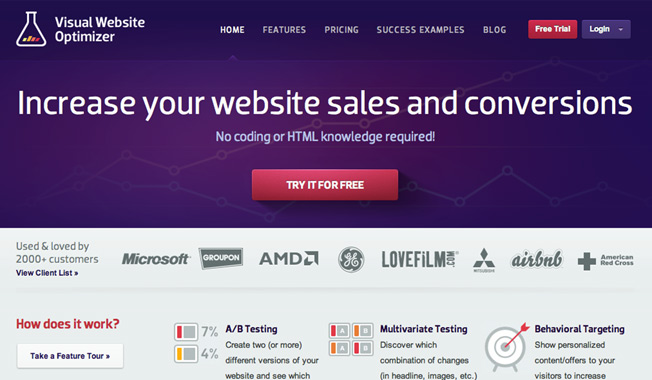
And this is Visual Website Optimizer at 1024. Aah, it’s all there – good headline, bright CTA, social proof, and some VIA. Even on a smaller screen, the most important elements will be visible.
TIDY VISUALS
If you have spent more than 30 minutes on the Internet, you likely have seen one of those ads that has a GIF of a rotting banana with the headline “Lose 50 lbs with this one weird trick.”
Unless you’re actually selling a miracle weight loss cure to suckers, don’t let your landing page be that ad.
As with the headline, distracting elements can work when you’re trying to get attention. But when people are on your site, you don’t want to sidetrack them with a bunch of visual junk.
- A clean, simple design with plenty of white space keeps people trained on your call to action.
- Big font makes it easy and compelling for them to read and understand what your site is all about.
- Bullets make big blocks of copy easy to scan.
- Videos pack a big impact into a small space and can increase conversions 80%.
Images and graphics that are relevant to your product and related to your audience support your message instead of diverting attention.
Considerations for strategy
This is another good area to test. Does your audience react better to photos or illustrations? People or objects? Does it help to show the product in action?
Considerations for design
- Less is more. It’s tempting to add dramatic swirls, jQuery sliders, exploding graphs, and stock photos of people looking deliriously happy with their computers. But as with everything else, make sure it is in service of, and not distracting from, getting visitors to take action.
- Speed matters. A landing page that loads quickly gets better response. Make sure your design doesn’t slow down load time.
The cautionary tale

My Health Insurance. To quote Whitney Houston: Hell to the no. Among other horrors, we have here the cheesiest of cheesy stock photos, one of which is distorted; an extremely unsubtle arrow pointing at a button that isn’t even a button; pixelated text; something that says “Choose your plan” and yet doesn’t give you anything to choose; and of course the clownishly huge “Click Here” button, which doesn’t tell you what will happen when you do. I suspect your computer will blow up.
Doing it right
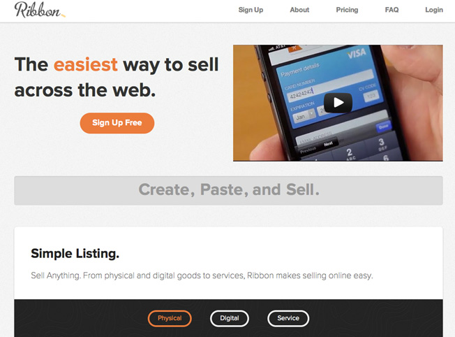
Ribbon. The use of color here draws your eye to the call to action. Navigation items are muted. The design is clean and simple, and the product is shown in action with a video.
SOCIAL PROOF
I once had a summer job at a nonprofit where I collected money door to door. One day I got on a bit of a roll and signed up several people in the same neighborhood. After a while, I didn’t even need to go into my pitch; I just held up my sheet, showed people that all their neighbors had donated, and they ponied right up.
As social creatures, humans tend to place greater value on things that other people have already approved. That is why most sites will tend to display evidence of such social validation:
- A list of customers
- Press mentions
- Usage statistics
- Testimonials
If you are just starting out, you probably don’t have a lot of this. But even one or two quotes from beta users, alpha users – heck, your mom – can show site visitors that someone else has derived value from what you’re offering.
Considerations for strategy
Gather up some good evidence of social proof for your page. And if your page is long-lasting (like a home page), keep it updated. Include new press attention, updated user numbers, great customer quotes, etc.
Considerations for design
Even if you’re displaying client or press logos, it’s important to keep the design clean and focused. Make sure the logos are of uniform size, and display them in gray scale if possible to minimize clashing colors and keep the focus on you.
The cautionary tale
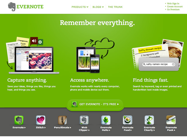
Evernote. This is a very clean, pretty page, and the VIA are beautifully displayed. But the CTA is literally fading into the background, and there’s no social proof. I think everyone in the world uses Evernote based on the number of other apps I see that connect to it. Maybe they’re shy. Don’t be shy, Evernote!
Doing it right
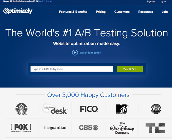
Optimizely. Four pieces of social proof on one screen: the note about being featured on CNN up top, the “#1” statement in the header, “3,000 happy customers,” and the visually uncluttered presentation of notable logos.
CONCLUSION
All of these recommendations can be summed up pretty simply: be clear about what action you want the visitor to take and make it as easy and compelling as possible for them to take it. You, too, will soon have a landing page that CONVERTS!
Oh and P.S. – Don’t forget to test!
About the Author: Beth Morgan is marketing consultant and early-stage startup advisor. You can find more of her writing at her website, Marketing Nerdistry, or follow her on Twitter.